Recently I barely managed to register for this year's Google IO conference. One of my favorite sessions from last year's conference was on UI patterns in Android.
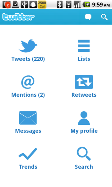
It's a great video, you should definitely watch it. The first pattern that they talk about is the Dashboard. You can see their example of a dashboard in the video, but there was an even more concrete example: Twitter for Android. The Twitter app was released just before IO, and it was developed jointly by Google and Twitter. It showcased the UI patterns that Google wanted designers and developers to start using to help create some expectations for users. Here's the Twitter dashboard:
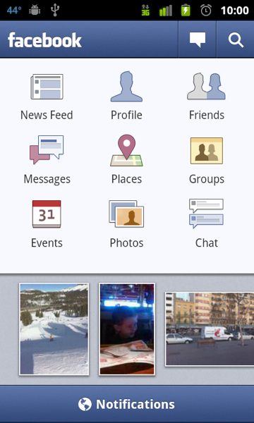
The idea is simple. The home screen of your app provides shortcuts to all of the major components of the app. The combination of using this pattern in a popular app (Twitter has 5M+ downloads) and evangelizing it at the IO conference certainly had the desired results. Many other apps adopted the pattern, including every platform's most popular app, Facebook:
The pattern has been a hit with note-taking/organizer apps like Evernote:
Evernote's more recent competitor Springpad also uses a dashboard:
Evernote and Springpad are both popular apps, with more than 1.5M downloads between them. Another very popular app that uses the dashboard is Yelp:
Google's Yelp/Foursquare compettitor Places also uses the dashboard pattern:
Finally, there's my favorite Android music player MixZing:
MixZing shows that you can be a little creative with the dashboard pattern. So the pattern's been a big success, right? Users are familiar with it and developers have embraced it. So it was a little surprising to me to see that Twitter has now decided that the dashboard is not so good after all:
There's no more dashboard in the 2.0 version of Twitter's app. The release notes allude to the major problem with the dashboard pattern: it forces the user to constantly go to the dashboard if they want to navigate to a different part of the app. It makes everything at least two taps away. Of course it makes it easy for the user to find things, since they can just go to the dashboard to find a shortcut to whatever they are looking for. For example, how do you think you find what's trending on the Twitter app now (go to search) or view your profile (gotta use the dreaded Android menu)? Maybe Twitter has found that their users rarely use these features, so the new design will be more effective for the vast majority of their users.
Speaking of the new design, it obviously uses a tab layout. This is a more common UI pattern in Android and has its own set of APIs to make it easy to use for developers. There are a lot of examples of tab layouts out there, such as Foursquare:
Another example is one of my favorite apps, Bump:
I won't bore you with more examples, as there are a lot. I think it's often very comfortable for a web app going native to use a tab design. It often mimics their website. That's why I picked Foursquare and Bump, two apps that are what I would consider mobile-first. Most people's first interaction with either company is through their mobile apps, not through their desktop web browser.
The other common pattern worth mentioning briefly is what I call Listomania. You start off with lists, and keep going from there like traversing a tree. Here's Google Reader:
And here's Kayak's listomania:
Personally I don't find the Listomania format very user friendly. I think it is often a by-product of porting an iPhone app that makes heavy use of UINavigationControllers (in all fairness, many of the tab-using Android apps are the products of porting iPhone apps that used a UITabBarController). I think the dashboard usually solves the same kind of problem (lots of features, hierarchy) in a nicer way. The tab alternative is more of the Pareto principle, putting all of the focus on the most commonly used features. Anyways, it will be interesting to see if the dashboard pattern becomes less common now that it's poster-child has ditched it.


