Recently I barely managed to register for this year's Google IO conference. One of my favorite sessions from last year's conference was on UI patterns in Android.
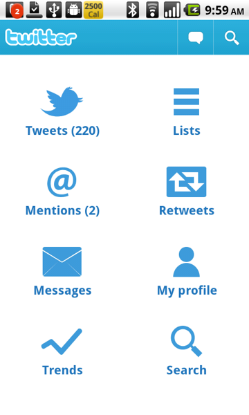
It's a great video, you should definitely watch it. The first pattern that they talk about is the Dashboard. You can see their example of a dashboard in the video, but there was an even more concrete example: Twitter for Android. The Twitter app was released just before IO, and it was developed jointly by Google and Twitter. It showcased the UI patterns that Google wanted designers and developers to start using to help create some expectations for users. Here's the Twitter dashboard:
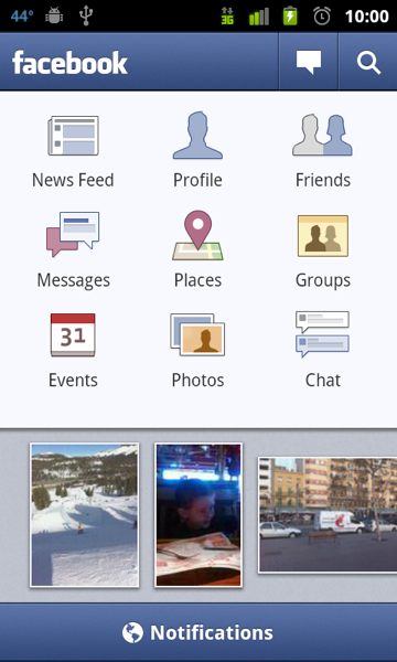
The idea is simple. The home screen of your app provides shortcuts to all of the major components of the app. The combination of using this pattern in a popular app (Twitter has 5M+ downloads) and evangelizing it at the IO conference certainly had the desired results. Many other apps adopted the pattern, including every platform's most popular app, Facebook:
The pattern has been a hit with note-taking/organizer apps like Evernote:
Evernote's more recent competitor Springpad also uses a dashboard:
Evernote and Springpad are both popular apps, with more than 1.5M downloads between them. Another very popular app that uses the dashboard is Yelp:
Google's Yelp/Foursquare compettitor Places also uses the dashboard pattern:
Finally, there's my favorite Android music player MixZing:
MixZing shows that you can be a little creative with the dashboard pattern. So the pattern's been a big success, right? Users are familiar with it and developers have embraced it. So it was a little surprising to me to see that Twitter has now decided that the dashboard is not so good after all:
There's no more dashboard in the 2.0 version of Twitter's app. The release notes allude to the major problem with the dashboard pattern: it forces the user to constantly go to the dashboard if they want to navigate to a different part of the app. It makes everything at least two taps away. Of course it makes it easy for the user to find things, since they can just go to the dashboard to find a shortcut to whatever they are looking for. For example, how do you think you find what's trending on the Twitter app now (go to search) or view your profile (gotta use the dreaded Android menu)? Maybe Twitter has found that their users rarely use these features, so the new design will be more effective for the vast majority of their users.
Speaking of the new design, it obviously uses a tab layout. This is a more common UI pattern in Android and has its own set of APIs to make it easy to use for developers. There are a lot of examples of tab layouts out there, such as Foursquare:
Another example is one of my favorite apps, Bump:
I won't bore you with more examples, as there are a lot. I think it's often very comfortable for a web app going native to use a tab design. It often mimics their website. That's why I picked Foursquare and Bump, two apps that are what I would consider mobile-first. Most people's first interaction with either company is through their mobile apps, not through their desktop web browser.
The other common pattern worth mentioning briefly is what I call Listomania. You start off with lists, and keep going from there like traversing a tree. Here's Google Reader:
And here's Kayak's listomania:
Personally I don't find the Listomania format very user friendly. I think it is often a by-product of porting an iPhone app that makes heavy use of UINavigationControllers (in all fairness, many of the tab-using Android apps are the products of porting iPhone apps that used a UITabBarController). I think the dashboard usually solves the same kind of problem (lots of features, hierarchy) in a nicer way. The tab alternative is more of the Pareto principle, putting all of the focus on the most commonly used features. Anyways, it will be interesting to see if the dashboard pattern becomes less common now that it's poster-child has ditched it.


8 comments:
Interestingly, I have always hated Twitter's app, and chose Seesmic over it _because_ of the dashboard pattern -- which I didn't even know as a pattern until now. I just new that Seesmic showed me what I wanted from the start, while Twitter had me making the same choice over and over every time I opened the application.
Having to navigate first to the dashboard to change what I was seeing was also annoying, to a lesser extent (because I rarely had need to do so).
Really, user actions must be counted when designed an interface, and then weighted using a fibonacci scale, starting at 3.
I have an Android (HTC EVO) and an iPod Touch, and really prefer the UI of the Android apps. Many of the apps highlighted here are ones I use often (Twitter, Facebook, Evernote, Yelp, Foursquare) and love the dashboard pattern. For me, it's sort of home base and I don't mind having to go back there to get elsewhere.
But that's my personal preference & I'd love to see some research from UI groups.
I agree with Daniel. I specifically don't use the Dashboard pattern apps. And I even tend to avoid the Google Maps local search stuff because I hate that restrictive little grid. It's more or less as easy to type.
It's the same thing as every overlay (and finally base Android, right?) getting press-and-hold home to jump to other running apps. Why jump back to any list, when I can jump across to other features?
I have read somewhere that Twitter decided to abandon the dashboard to unify UX criteria among platforms. This new Android app looks a lot similar to twitter.com indeed.
BTW, this version is buggier than its predecessor, at least for me... For example, I usually have old tweets at the top of the list, and the only way to get rid of them is closing session and reopen it
Personally, I prefer the Dashboard. I know it's an extra click away, but I like the back button and am used to it (I instinctively try to use it every time I pick up an iOS device). Personally, I think the Dashboard, and the back button, combined, make things nice for the people. (All the damn tabs start getting too small, even the "action bar" on the top/bottom of a lot of apps that also use DB can be too small, if it's 3-4 buttons, maybe, but you start putting 5-7 whatever, use the DB, or another metaphor of some type, don't just cram it in there.)
If you've recently gotten your first iPhone, congratulations, but you're a little late to the party! Don't worry, one of the biggest draws to the iPhone is that it is easy to use and get the hang of. One of the main things you are going to want to do as a new user, is download apps. See more evernote vs springpad
We are a third party technical support service. Avast Customer Support is here to help you out with the whole procedure to Download Avast Antivirus online, We not only fix your Avast Support related issues but will guide with how to get started with your new Avast product once it gets installed successfully.We at Avast Tech Support provides service to protect your PC from potential online threats and external attacks like viruses, Trojans, malwares, spywares and phishing scams. And Avast Refund. Call on our Avast Phone Number.
Gmail Customer service is a third party technical support service for Gmail users when they face any technical issue or error in their Gmail account. Our Gmail Customer Support team solves issues like forgot Gmail account password, Gmail configuration or Sync issues, recover deleted emails and many more.
How you install or reinstall Office 365 or Office 2016 depends on whether your Office product is part of an Office for home or Office for business plan. If you're not sure what you have, see what office com setup products are included in each plan and then follow the steps for your product. The steps below also apply if you're installing a single, stand-alone Office application such as Access 2016 or Visio 2016. Need Help with office setup Enter Product Key?
Norton Tech Support is a third party service provider and not in any way associated with Norton or any of its partner companies. At Norton Support we offer support for Norton products and sell subscription based additional warranty on computer and other peripheral devices.
Post a Comment